Dinosaurs have captivated human imagination since their fossil discoveries in the 19th century, evolving from scientific curiosities to powerful cultural symbols. Their imposing stature, prehistoric mystique, and universal recognition have made them perfect icons for corporate branding. Companies across various industries have harnessed dinosaurs’ visual impact and symbolic qualities to create memorable logos and brand identities. These prehistoric creatures convey strength, endurance, and a certain timelessness that resonates with consumers of all ages. From petroleum giants to sports teams, entertainment franchises to technology companies, dinosaur imagery has proven remarkably versatile in the commercial landscape. This article explores the most recognizable and influential dinosaur-themed logos and brands that have made their mark on our collective consciousness.
Sinclair Oil’s Iconic Green Brontosaurus

Perhaps the most enduring dinosaur logo in American corporate history belongs to Sinclair Oil, whose friendly green Brontosaurus (now scientifically classified as Apatosaurus) has served as the company’s mascot since 1930. Named “Dino,” this sauropod was originally chosen because petroleum products come from the Mesozoic era when dinosaurs roamed the Earth, creating a clever connection between the product’s origins and its branding. The Sinclair dinosaur gained nationwide recognition during the 1933-34 Chicago World’s Fair and became permanently embedded in American culture during the 1964-65 New York World’s Fair, where large animatronic dinosaurs delighted visitors. Remarkably consistent for over 90 years, the friendly green dinosaur continues to serve as Sinclair’s primary brand ambassador, appearing on gas stations across the United States and maintaining its status as one of the most recognized corporate mascots in America.
Toronto Raptors and the Basketball Dinosaur
When the NBA expanded into Canada in 1995, the Toronto franchise embraced the dinosaur trend sparked by “Jurassic Park,” naming their team the Raptors. Their original logo featured a red Velociraptor wearing basketball shoes and clutching a basketball in its claws—a design that quickly became one of the most distinctive and popular in professional sports. The aggressive yet playful dinosaur imagery helped establish immediate brand recognition for the fledgling team. Though the Raptors modernized their logo in 2015 to a more streamlined claw-marked basketball, they maintained dinosaur imagery in alternate logos and occasionally bring back the original dinosaur for throwback jerseys and merchandise, which consistently rank among the NBA’s best-selling items. The original dinosaur logo has achieved cult status among basketball fans and remains inseparable from the team’s identity, demonstrating the enduring appeal of dinosaur branding in sports.
Mozilla Firefox’s Fiery Dinosaur Origins
Many internet users are surprised to learn that the Firefox browser’s logo originated from a dinosaur concept. When the browser was first developed, it was named “Phoenix,” then briefly “Mozilla Firebird” before settling on “Firefox.” During this transition period, the early logos featured a Tyrannosaurus rex alongside a flaming fox, representing the browser’s power and speed. Although Mozilla eventually simplified the logo to focus solely on the fox element, dinosaur imagery remains part of the company’s visual culture. Mozilla’s offices display dinosaur art, and their error page famously features a pixelated T. rex from Chrome’s offline dinosaur game—a playful nod to their browser competitor. This dinosaur connection, though no longer prominent in their logo, demonstrates how prehistoric imagery initially helped position Firefox as a powerful alternative in the browser market, establishing a foundation for what would become one of the world’s most popular web browsers.
Jurassic Park’s Iconic T. Rex Skeleton Logo
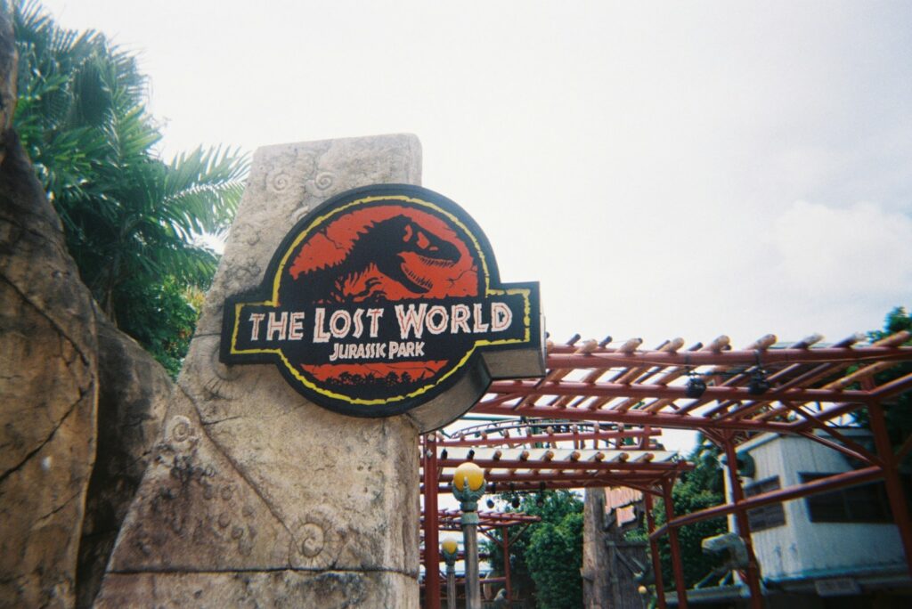
Perhaps no dinosaur logo is more immediately recognizable than the Jurassic Park franchise’s black T. rex skeleton silhouette against a red background. Created for Steven Spielberg’s groundbreaking 1993 film, this logo transcended its movie origins to become a stand-alone cultural icon. Designed by Chip Kidd based on an illustration from the book “Prehistoric Animals” by Michael Hallett, the logo perfectly captured the film’s blend of scientific authenticity and primal fear. The simplicity and boldness of the design have allowed it to remain virtually unchanged through multiple sequels spanning nearly three decades. The logo appears not just on films but on a vast empire of merchandise, theme park attractions, video games, toys, clothing, and even limited-edition vehicles. Its ubiquity has made the Jurassic Park T. rex skeleton one of the most profitable and recognizable logos in entertainment history, instantly evoking the wonder and terror of dinosaurs brought back to life.
Denver Nuggets’ Rainbow Skyline Dinosaur
From 1981 to 1993, the Denver Nuggets of the NBA employed one of the most distinctive and beloved logos in sports history—a red Maximus the Dinosaur (resembling a Stegosaurus or Apatosaurus) against the team’s famous rainbow skyline background. This uniquely Colorado-centric design combined the state’s famous mountain vistas with reference to the region’s rich paleontological history, particularly the numerous dinosaur fossil discoveries in the Rocky Mountain area. Though the team eventually moved away from this design toward more conventional imagery, the rainbow dinosaur logo maintains a special place in NBA design history. The nostalgia for this distinctive era of basketball aesthetics has proven so powerful that the Nuggets occasionally revive elements of the design for special throwback nights and limited-edition merchandise. Fan campaigns periodically emerge calling for a permanent return to the dinosaur logo, demonstrating how deeply dinosaur imagery can resonate with audiences even decades after its initial use.
The Chrome Dinosaur Game Phenomenon
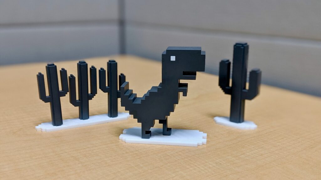
While not initially created as a brand logo, Google Chrome’s offline dinosaur game has become one of the most recognizable dinosaur icons in modern digital culture. Affectionately nicknamed “Dino” or “T-Rex Runner,” the pixelated gray Tyrannosaurus that appears when Chrome users lose internet connection has transformed a frustrating experience into an engaging diversion. Introduced in 2014, the minimalist dinosaur design has become so popular that Google has maintained it through multiple browser updates and even celebrated its milestones with special editions, such as birthday hats on anniversaries. The game has been played billions of times, making it one of the most widely experienced video games in history. The Chrome dinosaur’s success demonstrates how even a simple, functional dinosaur design can develop into a beloved brand asset, with the dinosaur now appearing on official Google merchandise and becoming an unexpected mascot for the browser. This unplanned brand evolution shows the natural appeal dinosaurs hold in the digital landscape.
Calgary Flames’ “Blasty” the Fire-Breathing Dinosaur

The NHL’s Calgary Flames introduced one of hockey’s most distinctive alternate logos in 1998 with “Blasty,” a fierce black horse-head shaped logo with a dinosaur-like appearance breathing fire. While not explicitly a dinosaur, the logo’s prehistoric aesthetic and fire-breathing capability gave it a distinctly dinosaur-like quality that fans quickly embraced. The logo appeared on the team’s third jerseys until 2006 and developed a passionate following among hockey fans for its unique combination of aggression and regional identity, connecting to both Alberta’s fossil-rich badlands and its oil industry. After a 15-year hiatus, overwhelming fan demand prompted the Flames to resurrect “Blasty” for their reverse retro jerseys in the 2020-2021 season, confirming the enduring appeal of dinosaur-inspired sports branding. The success of this revival demonstrated that dinosaur imagery often develops cult followings that persist even when the logos are temporarily retired, showing the long-term brand value these prehistoric creatures can provide to sports franchises.
Dinosaur Comics’ Distinctive T. Rex

In the world of webcomics, Ryan North’s “Dinosaur Comics” has featured perhaps the most consistently used dinosaur imagery in modern media. Launched in 2003, this uniquely formatted comic uses exactly the same images of dinosaurs in every strip, with only the dialogue changing. The main character—a green Tyrannosaurus rex—has appeared in the same six panels daily for over 18 years, becoming an instantly recognizable icon in internet culture. The comic’s success demonstrates how even static dinosaur imagery can build a devoted following through consistent application. The T. rex character has appeared on bestselling merchandise, book collections, and even made cameo appearances in other media. What makes this example particularly notable is that North created a successful brand using public domain clipart of dinosaurs, proving that the appeal of dinosaur imagery doesn’t necessarily require extensive design budgets or sophisticated graphics. The comic’s longevity showcases how dinosaurs can provide sustainable brand identity even for independent creators with minimal resources.
The Land Before Time’s Distinctive Silhouettes

Don Bluth’s 1988 animated classic “The Land Before Time” established one of the most successful dinosaur brands in children’s entertainment, with its logo featuring the silhouettes of five different dinosaur species against a sunset backdrop. The simple yet emotionally resonant imagery perfectly captured the film’s themes of friendship, diversity, and perseverance. This branding proved so effective that it supported an astonishing 13 direct-to-video sequels between 1994 and 2016, along with a television series, merchandise lines, and theme park attractions. The consistent use of dinosaur silhouettes across all materials created immediate recognition among multiple generations of children. Unlike more scientifically oriented dinosaur brands, The Land Before Time’s success came from anthropomorphizing dinosaurs to create relatable characters that children could emotionally connect with. The franchise demonstrated how dinosaur branding could be successfully targeted specifically at young children while maintaining appeal across decades of changing entertainment trends and technologies.
Boston Celtics’ “Lucky the Leprechaun” Dinosaur Connection

In an unusual dinosaur branding connection, the NBA’s Boston Celtics incorporated subtle dinosaur imagery into their iconic “Lucky the Leprechaun” logo for several years. During the 1960s, the leprechaun character was occasionally depicted spinning a basketball on his finger while standing atop a stylized dinosaur that resembled a Celtic dragon. This unique combination connected the team’s Irish heritage with the popular dinosaur imagery of the era. The dinosaur element was eventually removed in favor of simpler designs, but it represents an interesting historical example of how prehistoric creatures were incorporated even into seemingly unrelated brand identities. Vintage merchandise featuring this dinosaur-leprechaun combination has become highly collectible among basketball historians and Celtics fans. This unusual pairing demonstrates how adaptable dinosaur imagery can be, fitting into brand stories even when the connection isn’t immediately obvious, and how these prehistoric creatures have been used to add visual interest to established logos across different eras of commercial design.
Dino from “The Flintstones” as Corporate Mascot
While not a logo in the traditional sense, Dino the dinosaur from Hanna-Barbera’s “The Flintstones” became one of the most recognizable dinosaur characters in advertising history through his association with various brands. The purple Snorkasaurus has appeared in campaigns for everything from Fruity Pebbles cereal to Flintstones vitamins, becoming a valuable commercial property for over six decades. Dino’s playful, dog-like personality made him particularly effective for marketing to children, offering a friendly, non-threatening dinosaur image that contrasted with the more ferocious dinosaur depictions in scientific contexts. This friendly dinosaur helped establish a template for how prehistoric creatures could be anthropomorphized for commercial purposes, influencing countless subsequent dinosaur mascots. The character’s longevity is remarkable—Dino has appeared in advertisements continuously since the 1960s, making him one of the longest-serving dinosaur representatives in commercial history. His success demonstrates how dinosaur characters can transcend their original context to become flexible marketing tools across multiple products and generations.
Dinosaur Jr.’s Purple Mascot
Alternative rock band Dinosaur Jr. has utilized one of music’s most distinctive logos since the 1980s—a purple cartoon dinosaur nicknamed “Pointy” that appears on their album covers, merchandise, and marketing materials. Created by artist Maura Jasper for the band’s second album, this deliberately naive, childlike dinosaur drawing contrasted sharply with the band’s loud, distorted sound, creating a memorable visual juxtaposition that helped them stand out in the crowded alternative music scene. The purple dinosaur became so integral to the band’s identity that it continued appearing on their materials even during lengthy hiatuses and lineup changes. Unlike corporate dinosaur logos designed by professional agencies, Dinosaur Jr.’s deliberately amateurish dinosaur demonstrated how even rudimentary prehistoric imagery could establish strong brand recognition in the right context. The logo’s hand-drawn quality aligned perfectly with the DIY aesthetic of independent music, showing how dinosaur imagery can be adapted to fit specific cultural niches rather than always appearing polished and commercial.
The Natural History Museum’s Dippy the Diplodocus
London’s Natural History Museum features one of the most culturally significant dinosaur brands in the form of “Dippy,” a Diplodocus cast that served as the museum’s central hall centerpiece for over a century. Though not initially designed as a logo, Dippy’s distinctive silhouette gradually evolved into the museum’s unofficial emblem, appearing on countless souvenirs, educational materials, and marketing campaigns. When the museum announced plans to replace Dippy with a blue whale skeleton in 2015, public outcry was so significant that the institution created a national tour for the beloved dinosaur. This public response demonstrated how deeply dinosaur imagery can become intertwined with institutional identity. Dippy has since been incorporated more formally into the museum’s branding, appearing in stylized form across digital platforms and merchandise. The Diplodocus’s journey from scientific specimen to beloved mascot illustrates how dinosaurs can organically develop into powerful brands through public affection rather than deliberate marketing strategies, creating emotional connections that commercial logos often struggle to achieve.
Dinosaur National Monument’s Governmental Imagery

Government agencies rarely embrace playful or commercial imagery, but Dinosaur National Monument in Colorado and Utah stands as a notable exception with its distinctive dinosaur logo. The National Park Service site features a stylized Allosaurus skull silhouette as its official emblem, appearing on signage, ranger uniforms, and official communications. This logo has remained remarkably consistent since the monument’s establishment in 1915, making it one of the oldest continuously used dinosaur logos in existence. The simple yet scientifically accurate design reflects the monument’s dual purpose of protecting both natural landscapes and one of the world’s richest dinosaur fossil deposits. Unlike commercial dinosaur logos that often take creative liberties, the monument’s emblem maintains paleontological accuracy while still functioning effectively as a graphic identifier. This governmental use of dinosaur imagery demonstrates how prehistoric creatures transcend commercial applications to serve as regional identifiers and educational symbols. The longevity of this logo showcases how effective dinosaur branding can be when it authentically connects to a genuine prehistoric heritage rather than simply exploiting dinosaurs’ popular appeal.
Conclusion

The enduring popularity of dinosaur logos and brands across diverse industries testifies to these prehistoric creatures’ remarkable staying power in commercial visual culture. From Sinclair Oil’s friendly Brontosaurus to the Toronto Raptors’ aggressive Velociraptor, dinosaurs have demonstrated remarkable versatility as brand ambassadors. Their appeal transcends demographics, working effectively for petroleum companies, sports teams, technology corporations, and children’s entertainment alike. The most successful dinosaur brands leverage specific qualities of these ancient creatures—whether strength, longevity, scientific wonder, or playful familiarity—to create meaningful connections with their audiences. As we’ve seen through these examples, dinosaur imagery continues to evolve alongside changing design trends while maintaining its fundamental appeal. Whether scientifically accurate or whimsically reimagined, these prehistoric icons show no signs of commercial extinction, continuing to capture imagination and build brand recognition in an increasingly crowded visual landscape.