
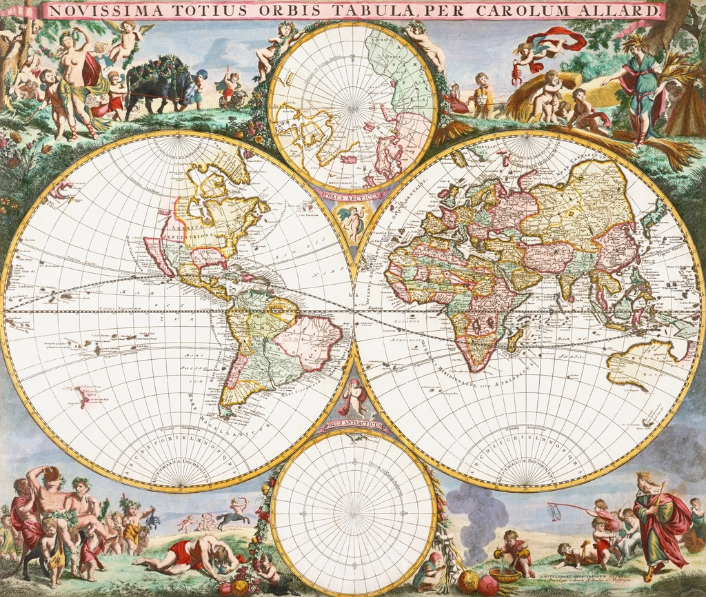
Most people assume old maps were just worse, blurrier versions of Google Maps – clumsy first drafts waiting for satellites to fix them. That assumption is wrong. Old maps weren’t failed attempts at accuracy; they were entirely different documents, built to record politics, religion, folklore, and fear as much as geography.
They tracked things a modern GPS app would never bother with – monsters, invented kingdoms, and blank spaces labeled “here be danger.” Here’s what cartographic historians actually say about the details modern maps erased for good, and why losing them cost us more than we realized.
#1 – Blank Spaces Marked “Unknown”
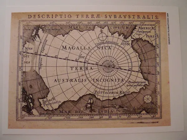
Old maps did something modern software refuses to do: admit ignorance out loud.
Cartographers before the 20th century regularly left enormous sections of continents completely empty, sometimes filled with a single label like terra incognita. Interior Africa, inland Australia, and the American West all sat blank on European maps for centuries, not because nobody cared, but because nobody who’d drawn the map had actually been there. A blank map was considered more honest than a guessed one.
That habit vanished almost entirely once aerial photography and satellite imaging arrived. Modern digital maps never show gaps – even remote deserts and unmapped jungle canopies get filled in with algorithmic terrain data, whether or not anyone has confirmed what’s really down there.
That confidence is arguably the biggest lie modern cartography tells. Wait until you see what old mapmakers claimed was actually swimming in the empty water.
#2 – Oceans Patrolled by Monsters
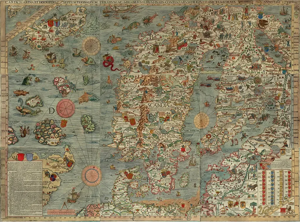
Sixteenth-century sailors didn’t just fear storms. They feared what mapmakers told them was living in the water.
The most famous example is the Carta Marina, published in 1539 by Swedish clergyman Olaus Magnus. At the time, it was the most detailed map of any part of Europe, a curious blend of personal observation, Scandinavian lore, and the teachings of ancient scholars. It wasn’t decoration for decoration’s sake – it was noted for its vivid portrayal of deadly creatures, with more than twenty featured on the map.
Researchers now believe most of these “monsters” were exaggerated whales. Magnus is known to have invented the appearances of some of his sea monsters, most of which we’d now recognize instantly as whales. He even offered survival advice: a sailor on the map is depicted holding not a weapon but a trumpet, because Magnus wrote that blowing a trumpet was one of the few ways to scare away a sea monster.
Fast Facts
- Published in 1539 by Swedish clergyman Olaus Magnus
- Featured more than twenty distinct sea monsters
- Most creatures were likely exaggerated whale sightings
- Sailors were advised to blow a trumpet to scare monsters away
Whales became monsters, and monsters became legend passed down for generations. Next up, an entire U.S. state spent two centuries floating free of the mainland – and almost nobody questioned it.
#3 – An Entire State Floating as an Island
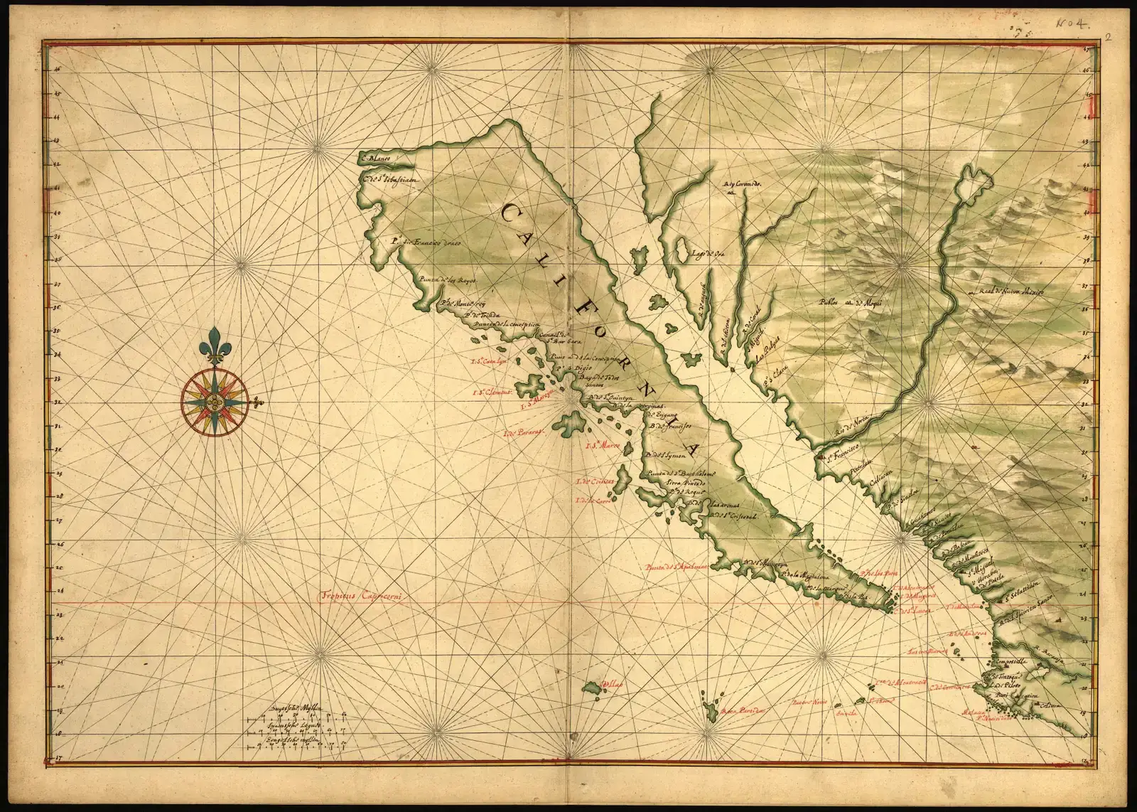
For nearly 200 years, European maps insisted California wasn’t attached to North America at all.
On early 16th-century maps, California was drawn as an island, its Gulf turned into a channel that entirely cleaved the “island” off from the mainland instead of stopping at today’s US-Mexico border. The myth spread fast because many European cartographers produced their maps by copying others, so California kept appearing as an island throughout the following two centuries, generation after generation, without anyone bothering to check.
This wasn’t a fringe theory, either. Collector Glen McLaughlin eventually tracked down more than 700 maps of California as an island from that period alone. The error was so persistent that California would appear as an island as late as 1865 on a map made in Japan, decades after American surveyors had corrected it at home.
It took a Jesuit priest walking overland to fix cartography’s most stubborn mistake. Father Eusebio Kino traveled through California between 1698 and 1701 before drawing his own corrective map, A Passage by Land to California. Modern satellite maps have never made a mistake this big, this often, for this long – but the mistakes didn’t stop at coastlines. Mapmakers used to invent entire civilizations too.
#4 – Kingdoms and Peoples Modern Maps Erased Completely
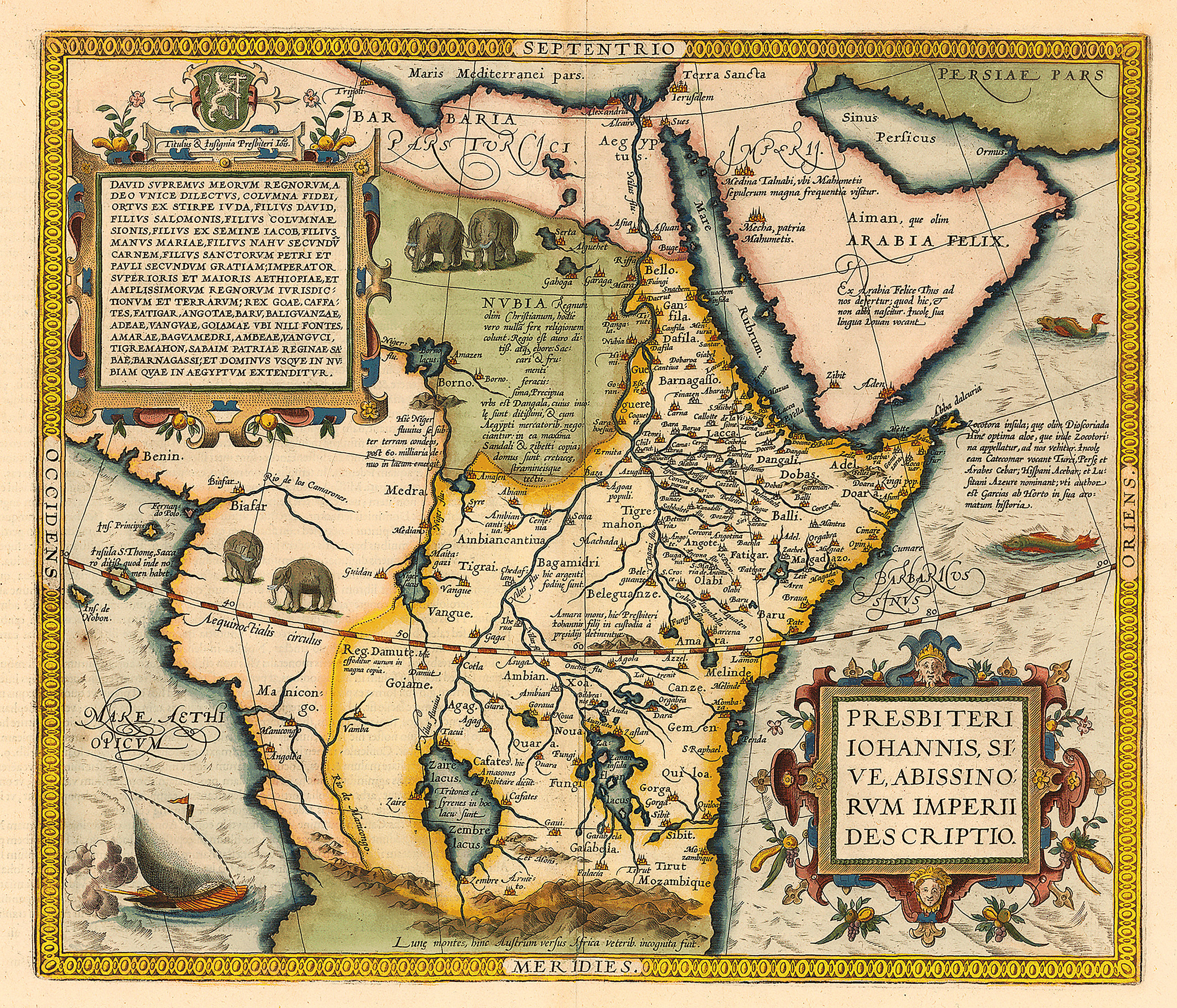
Medieval and Renaissance maps didn’t just misplace continents. They populated them with people who never existed.
Mapmakers routinely filled the margins of unexplored regions with legendary tribes drawn from classical and biblical sources – dog-headed men, one-footed giants who used their foot as a sunshade, and warrior women loosely inspired by Greek Amazon myths. These weren’t jokes tucked into corners; they were treated as plausible geography, the same way a modern map confidently labels a national park boundary.
The most persistent of all was the legend of Prester John, a supposedly Christian king ruling a vast, wealthy empire somewhere beyond the Islamic world – first placed in Asia, later relocated to Ethiopia once explorers failed to find him in India. European monarchs sent real diplomatic letters searching for this fictional ally for centuries.
Modern maps have zero tolerance for this kind of speculative population data. Every dot today is tied to a verified coordinate, a census record, or satellite confirmation, which makes sense for accuracy but erased a genre of mapmaking that treated the page as much as folklore as fact. Long before that folklore got erased, cartographers had already repositioned the entire planet around one holy city.
#5 – A World Centered on Jerusalem, Not the Equator
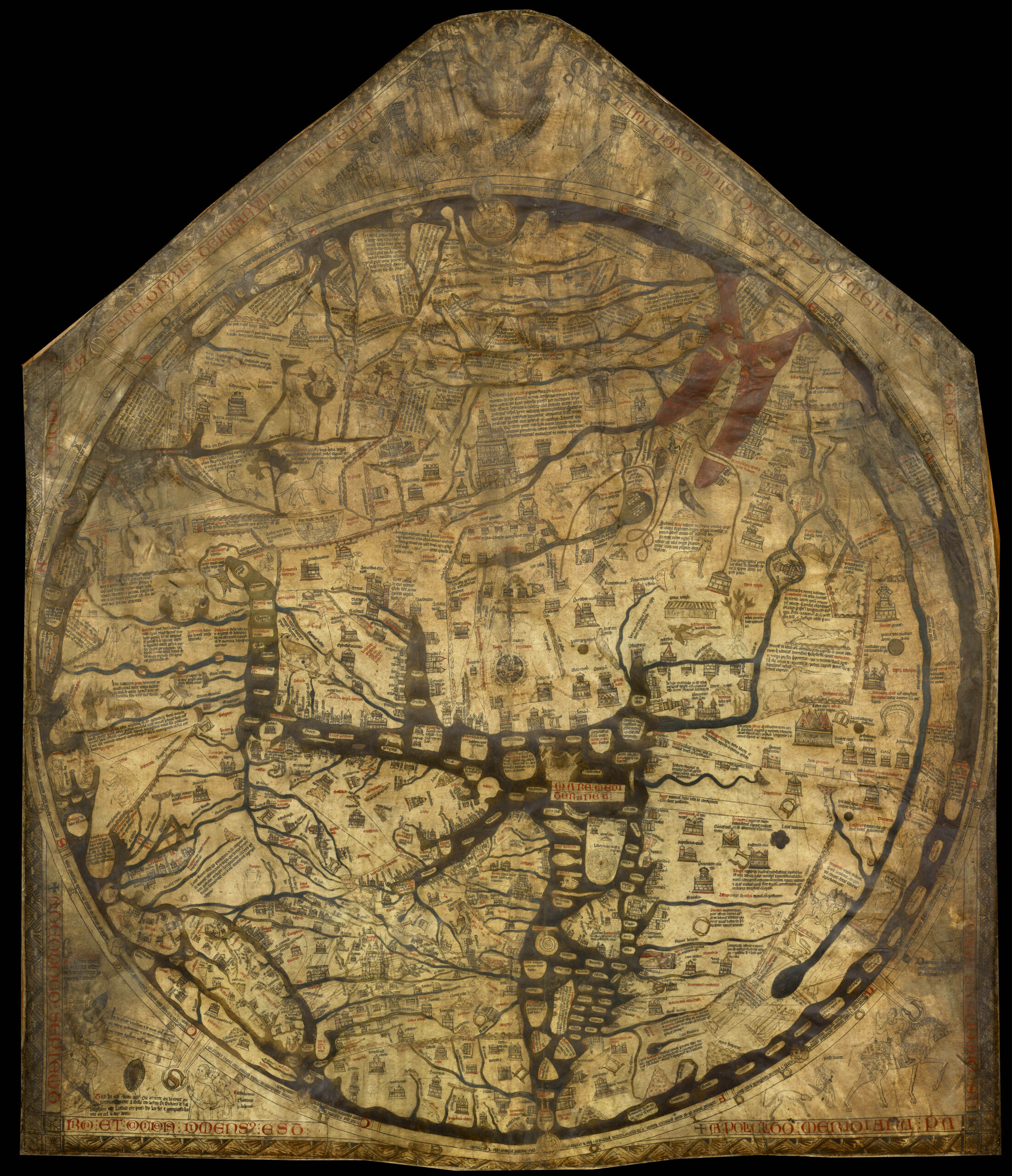
Before mapmakers cared about accurate distances, they cared about theology – and it showed.
Medieval European maps known as mappae mundi were frequently drawn as “T-O maps”: a T-shape splitting the known world into Asia, Europe, and Africa, all enclosed inside an O-shaped ocean. Geographic accuracy wasn’t the goal. Religious symbolism was. Jerusalem sat dead center on many of these maps, not because it was geographically central, but because it was considered spiritually central to Christian cosmology.
This wasn’t a fringe cartographic style – it dominated European mapmaking for hundreds of years, appearing in illuminated manuscripts, church art, and travel guides for pilgrims. The map was a sermon as much as a navigational tool.
Modern maps center on projections chosen for mathematical convenience or political neutrality, never theology. Nobody today would accept a road map that placed a religious site at the exact middle of the page regardless of actual coordinates – but for centuries, that was standard practice. And the strangeness didn’t stop at what sat in the center; it extended to which direction was even considered “up.”
#6 – East at the Top, Not North
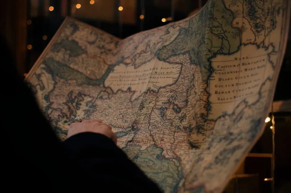
Here’s a detail that trips up almost every modern viewer of an old map: the orientation is often completely different from what we expect.
Many medieval maps put east, not north, at the top of the page – because east was where the sun rose, where Eden was believed to sit, and where paradise was traditionally located in Christian geography. That’s actually where the word “orient” comes from: to orient a map originally meant literally facing it toward the east.
North-up orientation didn’t become the universal standard until navigational charts and the printing industry pushed for consistency, largely driven by the practical needs of sailors using compasses and the rise of standardized atlases in the 16th and 17th centuries.
At a Glance
- Medieval maps: east at top, tied to sunrise and paradise imagery
- 16th-17th centuries: north-up gains ground with navigational charts and atlases
- Today: digital maps default north-up almost universally
- Rotation now only happens when a user actively drags the screen
Modern digital maps have taken this even further, defaulting to north-up almost universally and only rotating when a user actively drags the screen while navigating. The idea that a map’s top could represent a spiritual direction instead of a compass direction is completely foreign to how we read maps now. Distance itself used to work just as differently.
#7 – Distances Measured in Days, Not Miles
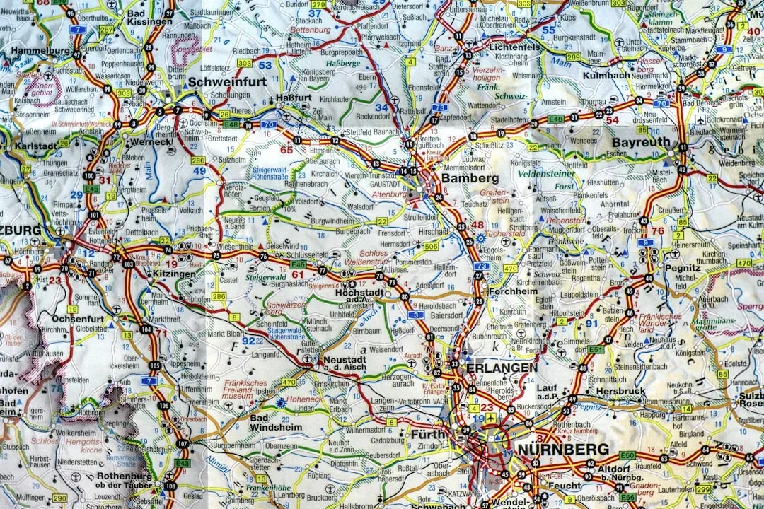
Old maps frequently didn’t bother with miles or kilometers at all. They measured the world in travel time.
Distances between towns, river crossings, or mountain passes were often labeled by how long it would take to get there – a day’s ride, a week’s march, three days by boat – rather than a fixed unit of measurement. This made sense for a traveler’s actual planning needs: knowing you’d reach the next town in “two days” was more useful on foot or horseback than knowing it was “38 miles” away, especially since terrain, weather, and road quality varied wildly and made fixed distances misleading anyway.
This system also reflected how differently people experienced geography before mechanized travel. A mountain pass wasn’t a static distance – it was an experience that changed length depending on snow, mud, or the condition of your horse.
Modern maps have gone in the exact opposite direction, quantifying everything down to estimated minutes based on real-time traffic algorithms. The old “how long will it take” system has been replaced by GPS predictions accurate to the minute – precise, but stripped of the human uncertainty that made old travel maps feel almost like diaries. Even the planet’s starting point used to be up for debate.
#8 – A Dozen Competing “Zero Points” for the Entire Planet
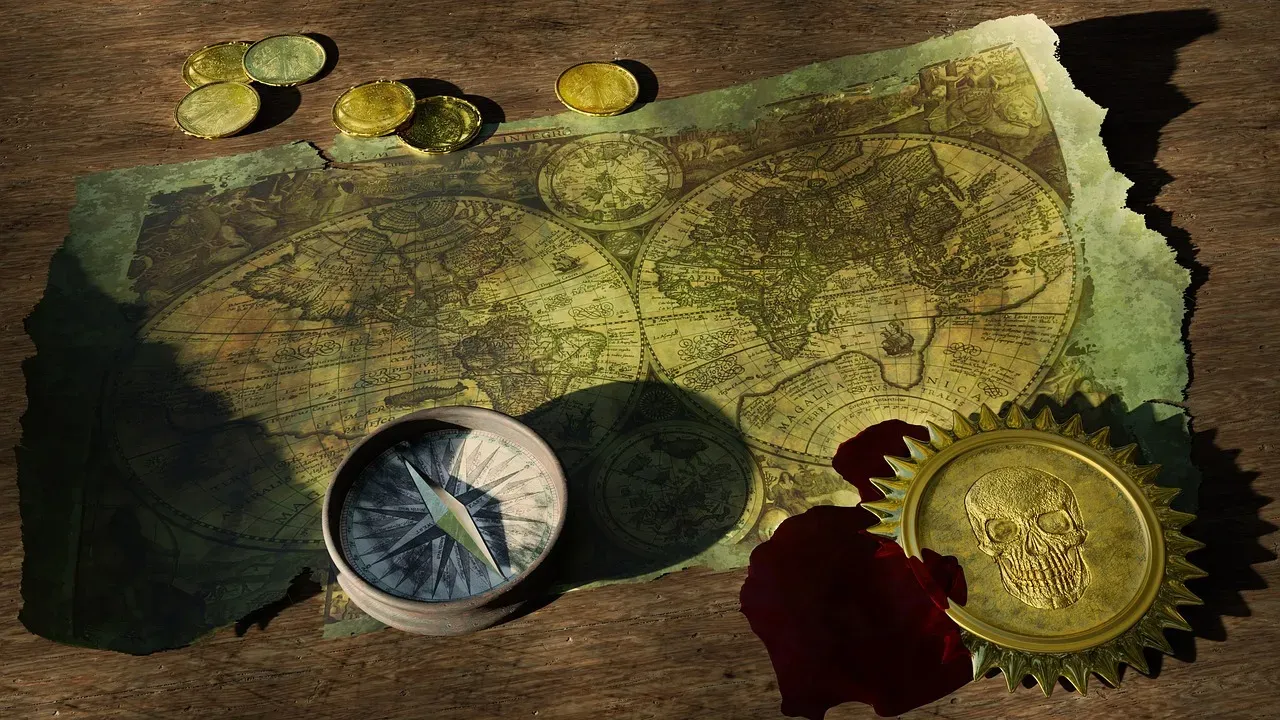
Modern maps agree on one starting line for longitude. Old maps absolutely did not.
European cartographers in the Middle Ages often used Jerusalem or Rome as a reference point, treating those cities as the symbolic starting point of zero longitude. As nations began exploring more aggressively, that religious logic gave way to national pride. Spain used the Madrid Meridian, France used the Paris Meridian established in 1679, and Britain used the Greenwich Meridian established in 1675 – three completely different “zero lines” running through three different capital cities, all in use at the same time.
The United States joined the chaos too. In 1850, Congress officially set a prime meridian for the nation that ran through Washington, D.C., and according to some cartographic historians, the U.S. actually used four different meridians centered on Washington at various points.
Quick Compare
| Meridian | Country | Established |
|---|---|---|
| Madrid | Spain | Used regionally |
| Paris | France | 1679 |
| Greenwich | Britain | 1675 |
| Washington, D.C. | United States | 1850 |
It wasn’t until 1884, when the International Meridian Conference in Washington, D.C. saw 22 of 25 countries vote to adopt the Greenwich Meridian, that the world finally agreed on a single starting line – and even then, France abstained and continued using the Paris meridian until 1911. Modern GPS systems rely on a single global standard now, but for centuries, a “correct” map location depended entirely on which country drew the map. The ocean itself came printed with its own strange geometry too.
#9 – Oceans Crisscrossed by Straight Compass Lines
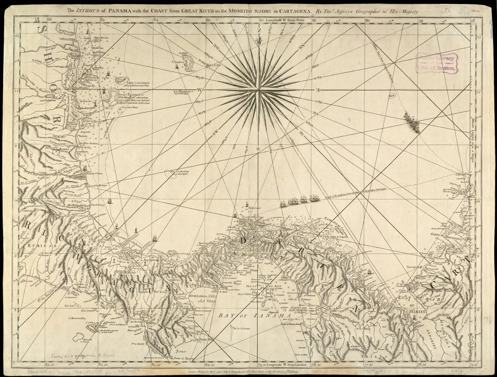
Zoom into an old nautical chart and you’ll notice something modern maps never show: a web of straight lines slicing across open ocean like a spiderweb.
These are rhumb lines, radiating out from compass roses printed directly on the water. Sailors used these lines to plot a constant compass bearing across open sea, since following a single fixed direction was far more practical with period instruments than attempting to calculate a curved great-circle route. The charts that used this system, called portolan charts, were originally developed by Mediterranean sailors and became essential tools for Atlantic and Pacific navigation during the Age of Discovery.
The compass roses themselves were often elaborately decorated, doubling as both a functional navigation tool and a piece of art, sometimes surrounded by wind heads blowing gusts from the cardinal directions.
Modern nautical charts still include some navigational lines, but nothing close to the dense, decorative webs that covered entire old ocean charts. Digital GPS navigation has made rhumb lines functionally obsolete – a route is now calculated instantly rather than plotted by hand across a grid of intersecting bearings. And yet none of this compares to the continent mapmakers invented purely on a hunch.
#10 – A Giant Continent That Existed Only on Paper
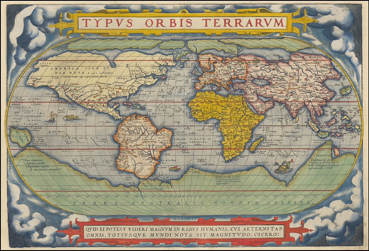
For roughly two thousand years, world maps confidently included a massive southern continent that nobody had ever actually seen.
Ancient Greek geographers theorized that a large landmass must exist in the southern hemisphere purely to “balance” the known continents in the north – a concept rooted more in symmetry and philosophy than observation. This hypothetical land, often labeled Terra Australis, appeared on maps for centuries, frequently drawn larger than Australia and Antarctica combined, despite zero confirmed exploration.
Mapmakers kept sketching in its coastlines confidently, adjusting the shape slightly with each new voyage that failed to fully disprove it. It took Captain James Cook’s extensive 18th-century Pacific voyages to finally establish that no such continent existed at the scale long assumed, shrinking the “mystery southern land” down to the much smaller, colder reality of Antarctica.
A landmass invented for the sake of visual balance survived on official maps longer than most empires have existed. Modern satellite mapping obviously has zero tolerance for continents based on symmetry theory rather than measured coastline data. Some old maps hid something far sneakier than a guess, though.
#11 – Fake Towns Hidden on Purpose
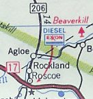
Some of the strangest entries on old printed maps weren’t mistakes. They were traps.
Paper towns are a cartographer’s trick to deter copyright infringement – a deliberately fictitious entry that lets a mapmaker know if his unique fake landmark shows up on a competitor’s map, proving his work was stolen. The most famous case is Agloe, New York. The name was invented by General Drafting Co. director Otto Lindberg and his assistant Ernest Alpers, combining their initials – OGL and EA.
The twist is almost unbelievable: Agloe became an actual landmark after mapmakers made up the community as a phantom settlement, attracting enough visitors that a real gas station and general store eventually opened there. When a rival mapping company copied the fake town, the original company tried to sue for copyright theft – only for the rival to point out that Agloe had genuinely become a real place by then.
Worth Knowing
- Agloe, NY got its name from mapmakers’ initials – OGL and EA
- A real gas station and store eventually opened at the fake spot
- A copyright lawsuit failed because the “fake” town had become real
- Michigan’s Beatosu and Goblu mocked a college football rivalry on an official map
Michigan’s state highway department pulled a similar stunt in the 1970s. Non-existent towns called Beatosu and Goblu appeared on Michigan’s official state map as a cheeky nod to the University of Michigan’s rivalry with Ohio State. A government agency snuck a football rivalry joke onto an official state document, and it worked for over a year before anyone noticed. The last entry on this list is quieter, but somehow the most unsettling of all.
#12 – Borders and Names That Simply Vanished
The most quietly unsettling thing old maps show isn’t a monster or a myth. It’s proof that permanence is an illusion.
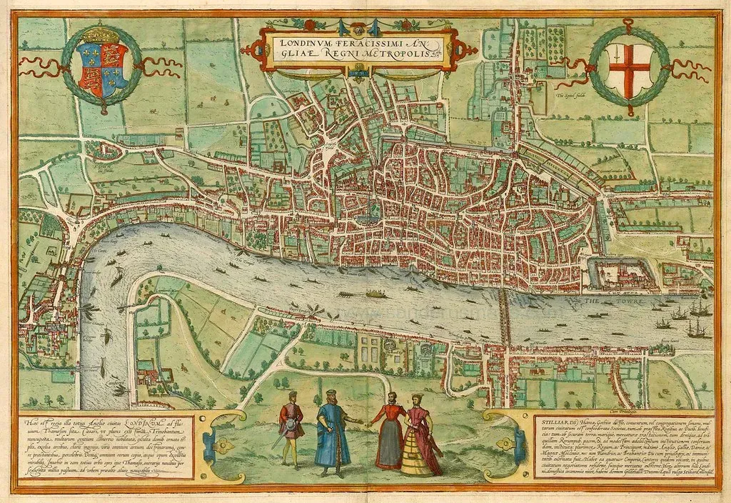
Old maps are packed with kingdoms, empires, and city names that no longer correspond to anything on a modern atlas – vanished polities, renamed capitals, and borders that shifted so many times the original lines are barely recognizable. Entire administrative divisions that once organized daily life for millions of people have simply been erased from collective memory, surviving only as ink on centuries-old parchment.
This isn’t a rare occurrence limited to ancient history, either. Even maps from just a century ago show empires, colonial territories, and national borders that were completely redrawn within a single generation, often due to war, treaty, or political collapse rather than any geographic reality changing at all.
Modern digital maps update these boundaries almost instantly, meaning today’s political reality gets recorded and normalized within days of a border change, leaving almost no visible trace of what existed before. Old maps, by contrast, remain frozen artifacts of a political moment, preserving the shape of a world that quietly stopped existing.
The Bottom Line
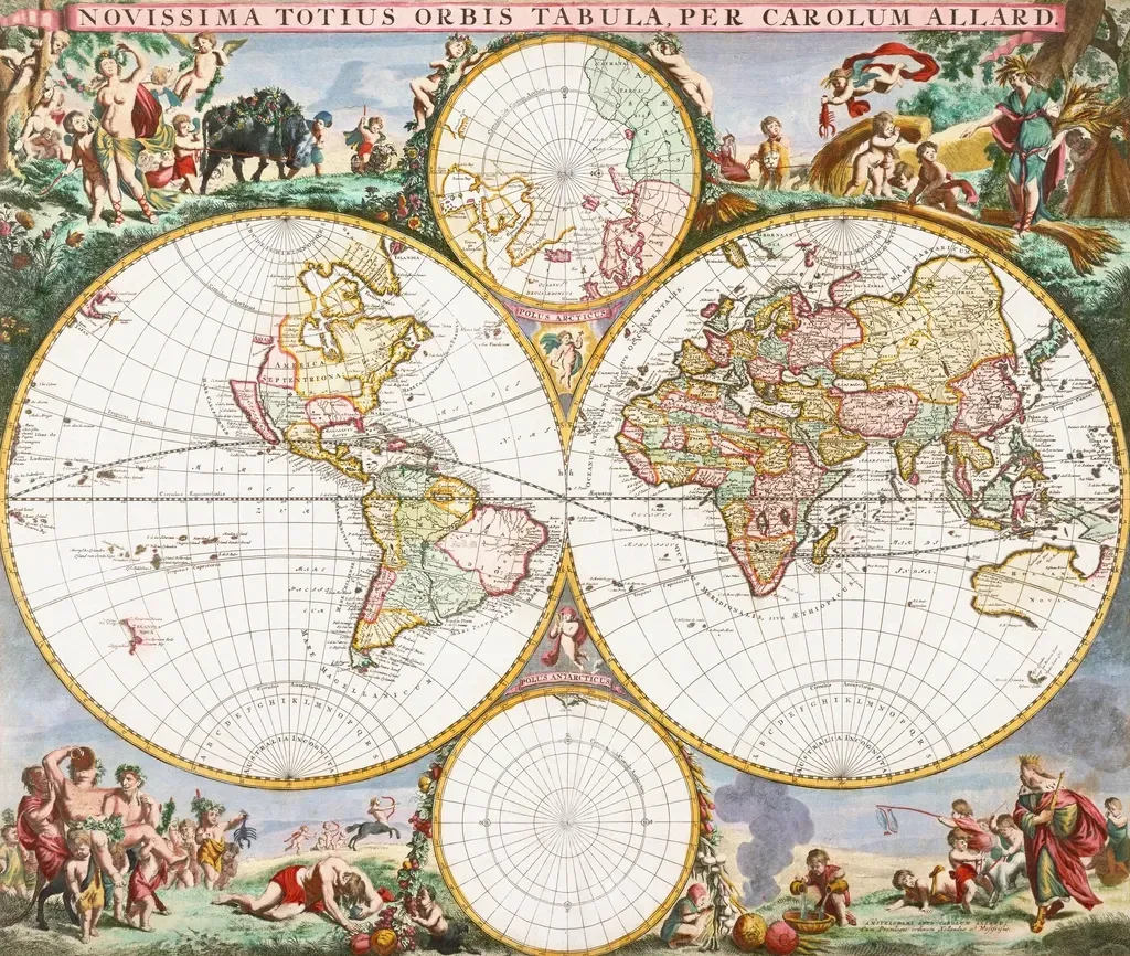
Old maps weren’t primitive. They were honest in ways modern maps refuse to be – admitting blank spots instead of guessing, drawing monsters instead of pretending certainty, and letting religion, politics, and rivalry shape the page.
California spent 200 years as a fictional island. A mapmaker’s inside joke became a real gas station. Modern cartography traded all of that personality for precision, and while GPS accuracy obviously wins on function, something genuinely strange got erased along the way.
Which of these forgotten map quirks surprised you the most? Drop it in the comments.