
Most people assume insurance paperwork is where curiosity goes to die. Then they see a Sanborn fire insurance map for the first time, and that assumption falls apart in about ten seconds.
These hand-colored sheets were drawn block by block across roughly 12,000 American towns, and they were never meant for public eyes. They existed purely so underwriters could calculate fire risk. But somewhere along the way, surveyors walking street after street accidentally built the most detailed snapshot of American urban life ever produced – one that still surprises historians, genealogists, and city planners today. Here’s what these maps actually captured, and why some of it is stranger than anyone expects.
#1 – Every Building’s Exact Footprint, Down to the Inch

Sanborn surveyors didn’t estimate. They walked. Field crews physically measured every structure on every block, tracing footprints onto paper with a precision that modern satellite imagery still struggles to match for that era.
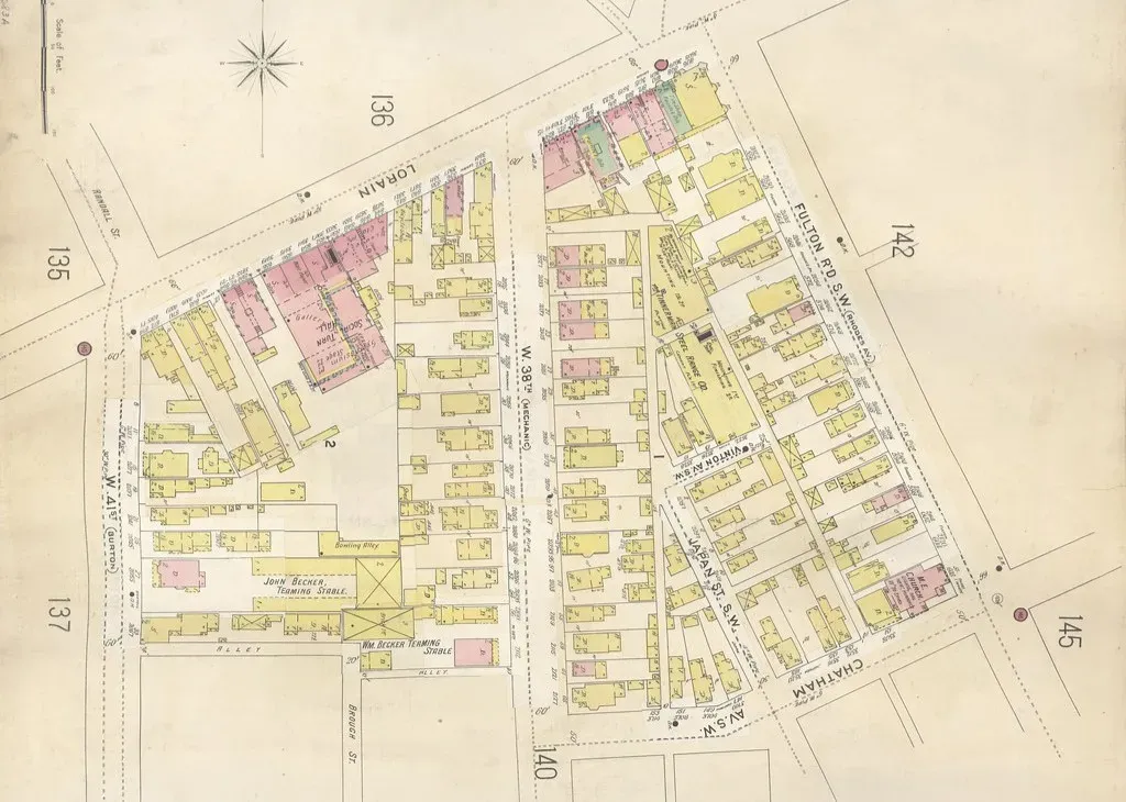
This wasn’t a rough sketch of a neighborhood – it was a lot-by-lot inventory of the built environment. Maps were drawn at a large scale, often 1:600, meaning a single city block could sprawl across an entire sheet. That level of granularity means historians can pinpoint exactly where a long-demolished building once stood, sometimes to within a few feet.
But footprints alone weren’t the real prize. It’s what those footprints were made of that mattered most to insurers, and that’s where things get genuinely revealing.
#2 – A Secret Color Code That Exposed Fire Risk Instantly

Insurance underwriters didn’t have time to read paragraphs of notes on every building, so Sanborn cartographers built a color language instead. A single glance at a block could tell an agent exactly how flammable it was.
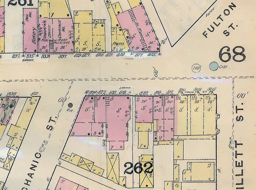
Green or gray meant fireproof or adobe construction. Blue meant stone or concrete. Red meant brick. Yellow meant wood frame – the color that should have made any underwriter nervous. Later editions refined the palette further, with olive green marking fire-resistive construction and gray still reserved for adobe.
Quick Compare
- Green or gray – Fireproof or adobe construction
- Blue – Stone or concrete
- Red – Brick
- Yellow – Wood frame (the highest fire risk)
- Olive green (later editions) – Fire-resistive construction
This wasn’t cosmetic. A row of yellow wood-frame buildings crowded together represented a much higher fire risk than spaced-out pink brick structures with fire walls between them. Underwriters could literally see danger in color before they ever read a word of text.
#3 – Height, Story Count, and Roof Type on Every Single Structure
It wasn’t enough to know a building’s footprint and material. Insurers needed to know how tall it stood and what kind of roof sat on top, since both factors changed how a fire would spread.
Surveyors recorded this obsessively. A simple numeral told the whole story: a “2” inside the building outline meant two stories, while a “B” or “Bsm’t” marked a basement level.
This detail matters enormously to modern researchers trying to date structures, because a building’s height and roofline often changed as it was renovated or converted to new uses. Comparing the same lot across multiple map editions lets historians track additions, fires, and rebuilds decade by decade – something no photograph from that era could ever capture as consistently.
#4 – Fire Walls, Parapets, and Structural Defenses Against Disaster

Beyond materials and height, Sanborn maps tracked something even more specific: the physical barriers builders installed to stop flames from jumping between buildings.
These fire walls were drawn with their own dedicated symbols. Exterior walls extending above the roofline to form parapets were shown as an extension of the wall line into the street, marked with cross lines – each one representing six inches of height. Even window construction got the same treatment, with a line at right angles marking wire glass set in metal frames.
This is where the maps stop looking like simple diagrams and start looking like engineering blueprints. Every wall thickness, every fire-resistant window, every structural safeguard was logged, because a single overlooked gap could mean the difference between an insurer paying out a small claim or an entire city block burning to the ground.
#5 – The Exact Location of Every Hydrant, Water Main, and Alarm Box
Buildings weren’t the only thing insurers cared about. They needed to know how fast a fire department could actually respond, which meant mapping the entire firefighting infrastructure of a city.
This is one of the most overlooked features of these maps today. In one Charleston survey, for instance, the Sanborn Map Company recorded a fire alarm box, a gas tank, and land heavily concentrated with wood-frame structures – all information of great interest to insurers calculating premiums.
Most people don’t realize a Sanborn map can tell you exactly which street corner had a working hydrant in 1904 – information city water departments sometimes lack in their own surviving records. For historians tracing the growth of municipal infrastructure, these maps are often the only surviving proof that a water system ever reached a particular neighborhood at all.
#6 – Hundreds of Business Types, Labeled Building by Building
Sanborn surveyors weren’t just cataloging structures – they were cataloging an entire economy, one storefront at a time.
The sheer variety is staggering: hotels, breweries, stables, cigar factories, chewing gum factories, jewelers, cobblers, canneries, boarding houses, manufacturers of artificial hair, cabinetmakers, photographers. Later maps kept pace with changing American life, adding roller rinks, movie theaters, and garages.
This turns a single map sheet into an economic census. A researcher can watch a lot transform from a livery stable into an auto garage into eventually a parking lot, tracing the entire arc of American transportation history through nothing but building labels on one small city block.
#7 – Red-Light Districts Hidden Behind a Single Euphemism
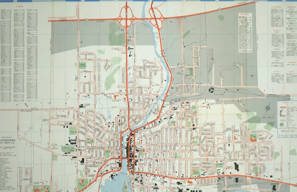
Here’s where these maps get genuinely uncomfortable, and genuinely fascinating. Insurance companies had zero interest in morality, but they absolutely needed to know where brothels operated, because those buildings carried unique fire and liability risks.
Rather than write the word outright, surveyors used a coded label: “Female Boarding.” Historians studying Minneapolis found this pattern repeatedly, with cartographers marking buildings “F.B.” – shorthand that historian Penny Petersen identified as a euphemism for brothel. In Bozeman, Montana, a building later confirmed as a house of prostitution appeared on the 1904 map simply as a “female boarding house.”
Some researchers argue this deliberate vagueness was a missed opportunity for honest record-keeping. Others insist it was simply pragmatic insurance shorthand – one that historians got lucky enough to crack decades later.
#8 – Opium Dens, Gambling Halls, and “Vice” Districts Mapped in Plain Sight
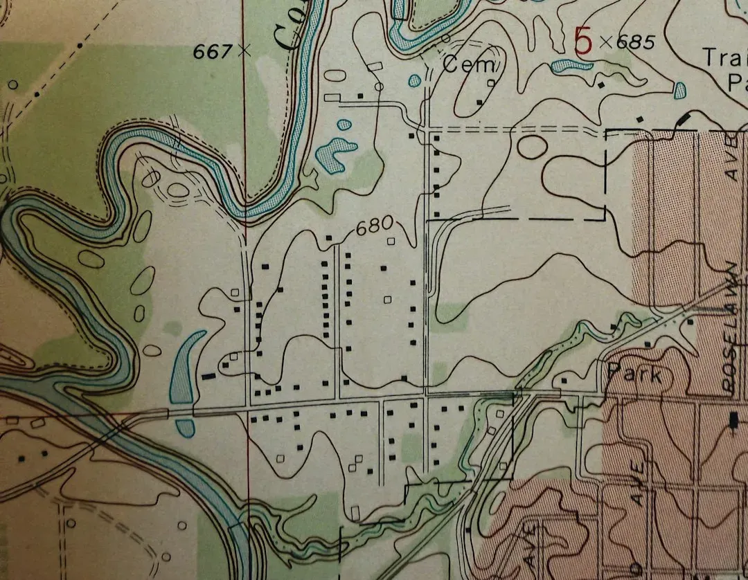
If brothels got a euphemism, some vice businesses didn’t even get that courtesy. They were labeled with startling directness.
A 1905 Sanborn map of Laredo shows just how far this went: City Hall, a “Mexican Theatre,” a building labeled “Mexican Produce,” a “cock pit,” a gambling den, and a bicycle mechanic, all on the same sheet. In Montana, an entire red-light corridor got its own nickname on paper – a 1916 map of Butte labeled it “Pleasant Alley,” later renamed “Venus Alley,” the city’s red-light district.
Worth Knowing
- Laredo, 1905: a cockpit and a gambling den sit on the same sheet as City Hall and a bicycle shop
- Butte, Montana, 1916: an entire alley of vice businesses was labeled right on the map, nickname and all
- Surveyors treated vice buildings like any other structure – because for insurance purposes, risk mattered more than reputation
It’s a strange kind of honesty. Insurers needed accurate risk data more than they needed discretion, so vice simply got filed alongside bakeries and hardware stores.
#9 – Immigrant and Ethnic Neighborhoods, Labeled With the Language of Their Time
Sanborn maps didn’t just track buildings – they tracked the people living in them, often using terminology that reflects exactly how segregated American cities once were.
Entire ethnic enclaves show up as distinct zones on these sheets. The 1899 Sanborn maps of Reno, Nevada, show schools, churches, a YMCA building, the Salvation Army building, two foundling and orphan homes, a mental hospital, and a “Chinese quarter” that included boarding houses, restaurants, saloons, tenements, and gambling places, with its own physician.
This is genuinely controversial territory for modern readers. Many preservationists argue these labels are uncomfortable proof of how thoroughly American cities segregated immigrant communities into specific blocks – not just socially, but on official insurance paperwork. Others counter that without this documentation, entire immigrant neighborhoods later bulldozed for urban renewal would have left almost no physical trace at all.
#10 – Churches, Schools, Orphanages, and Asylums Marked With Precision

Not everything on a Sanborn map was about commerce or vice. Insurers also needed to track a city’s civic and charitable infrastructure, because these buildings often held large crowds and carried their own unique risks.
The detail here can be startlingly specific. A 1899 Sanborn map of Tahlequah, Oklahoma, shows the Cherokee Male and Female Seminaries – tribal colleges that were among the first institutes of higher education established west of the Mississippi River. Reno’s 1899 survey logged its schools, churches, and foundling homes with the same care.
For genealogists, this category is gold. A single map sheet can confirm the exact location of an orphanage or seminary that closed a century ago and left no other surviving physical record, turning a fire risk document into one of the only proofs that certain institutions ever existed at all.
#11 – Industrial Hazards, Chemical Works, and Factory Equipment Down to the Machine

For factories, Sanborn surveyors went far beyond footprints and materials. They mapped the actual machinery and hazardous processes happening inside.
This level of interior detail is almost unheard of in historic cartography. In larger buildings, surveyors labeled the kitchen, the coal shed, or the exact location of particular pieces of factory equipment. Mechanical systems got the same scrutiny – buildings equipped with air conditioning were noted, right down to ducts running between floors and fan machinery housed in a separate structure on the roof.
Fast Facts
- Interior labels included kitchens, coal sheds, and specific factory machinery
- HVAC systems were tracked duct by duct between floors
- Rooftop fan houses were drawn as their own separate structures
- Few other historic records document industrial buildings at this level of interior detail
Most people assume old maps only show streets and buildings – few realize surveyors were literally noting the location of ductwork and rooftop fan houses. For anyone researching early industrial safety or the history of a specific factory building, this is often the only surviving floor-by-floor account of how a 19th-century operation actually functioned.
#12 – Street and Sidewalk Widths Down to the Foot

Every street a Sanborn crew surveyed got measured with the same obsessive precision applied to buildings, because narrow streets and alleys directly affected how fast fire could spread and how fast help could arrive.
Even the scale of these documents reflects that precision – often 1 inch equals 50 feet, close enough to capture individual sidewalks and property lines alongside street names and block numbers.
This street-level data has become unexpectedly valuable for modern city planners fighting to preserve historic street grids against highway expansion or redevelopment. When a preservation board needs proof that a colonial-era street was originally 30 feet wide before a later widening project, the Sanborn map – not the county deed office – is often the record that settles the argument.
#13 – A Photographic Record of Buildings That No Longer Exist Anywhere Else
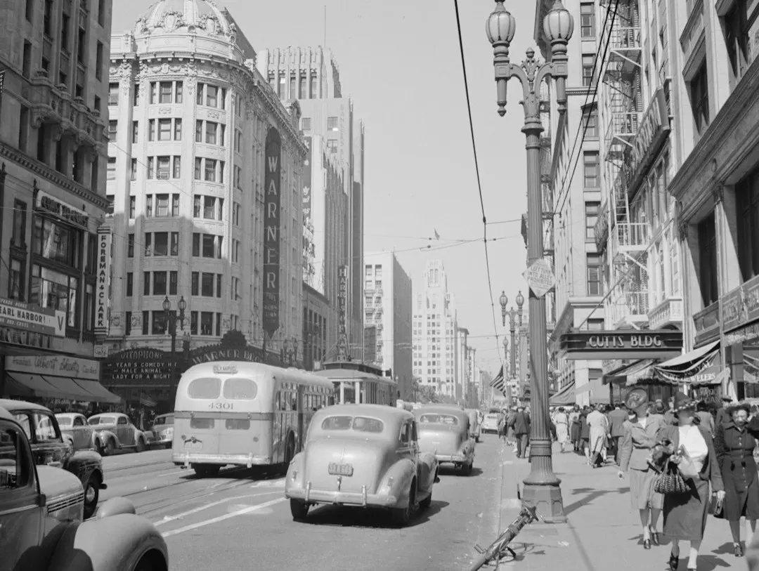
This is the biggest reason these maps matter today, and it’s the one that keeps historians coming back decade after decade: for thousands of American buildings, the Sanborn map is the only proof they ever existed.
These maps can reveal how a town looked decades before aerial photography, often showing buildings that have completely disappeared. Because large cities got a fully new edition every five to ten years, with paste-on correction slips issued in between, researchers can flip through editions like a flip-book and watch a neighborhood transform in real time.
At a Glance
- Nearly 12,000 U.S. towns and cities were surveyed block by block
- Many sheets were drawn at a scale of 1:600, sometimes down to 1 inch equals 50 feet
- Large cities typically received a full new edition every five to ten years
- Paste-on correction slips filled the gaps between full editions
No photograph collection, no newspaper archive, and no city directory comes close to matching that level of consistent, block-by-block coverage across an entire century of American growth.
The Bottom Line

These weren’t meant to be historical treasures. They were dry actuarial tools built to protect insurance company profits. That’s exactly why they’re so trustworthy today.
Nobody was curating these maps for a good story. Surveyors just recorded what stood on every lot, brothels and orphanages alike, without spin. That accidental honesty is what makes them irreplaceable now.
Whether you’re tracing a family’s old neighborhood or arguing with a city council about a historic street width, the Sanborn map is often the only document that settles the debate. What’s the strangest thing you’ve ever found hiding on an old Sanborn map? Drop it in the comments.