Walk into almost any natural history museum and you’ll feel it instantly: that mix of awe and clarity, as if someone has taken a few hundred million years of chaos and pressed it into a neat, easy-to-read story. It feels smooth, almost too smooth. Dinosaurs line up in tidy time periods, early humans march in a straight evolutionary parade, and dramatic extinctions arrive right on cue like chapters in a novel. It is powerful, moving, and strangely comforting.
But reality was never that tidy. Behind the glass cases and beautifully lit dioramas sits a messier truth: museums constantly make hard choices about what to show, what to leave out, and how to tell a story that regular people can actually follow in an afternoon. As someone who has lost track of time staring at fossil halls more than once, I’m convinced that understanding these quiet simplifications doesn’t ruin the magic – it deepens it. Once you see how the story is being streamlined, you start noticing the gaps, the questions, and the wild complexity hiding in plain sight.
1. Turning a Chaotic Timeline into a Straight, Simple Road
One of the biggest simplifications is the way museums present prehistoric time as a clean, linear road: first this era, then that one, with clear boundaries and memorable labels. Geological time in reality is more like a tangled web of overlapping environments, gradual shifts, and regional differences, but visitors usually see a timeline that marches steadily from the Precambrian to the present with crisp, colorful blocks. This design choice makes sense; our brains like stories with beginnings, middles, and ends, not sprawling timelines full of overlap and uncertainty.
To make things digestible, museums often compress unimaginably long stretches of history into just a few panels or a single wall graphic. Hundreds of millions of years might collapse into a single meter of space, while the last few thousand years of human history get lavish attention. I remember standing in front of one timeline thinking how unfair it felt that early marine life got the same visual space as a tiny bar labeled “human civilization.” Still, if curators tried to represent time at a truly accurate scale, the dinosaur era alone might stretch across city blocks, and nobody would read it.
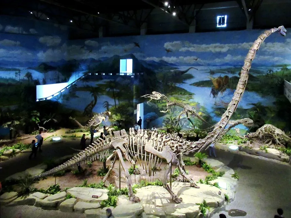
2. Painting Prehistoric Life with Broad Strokes and Representative Species
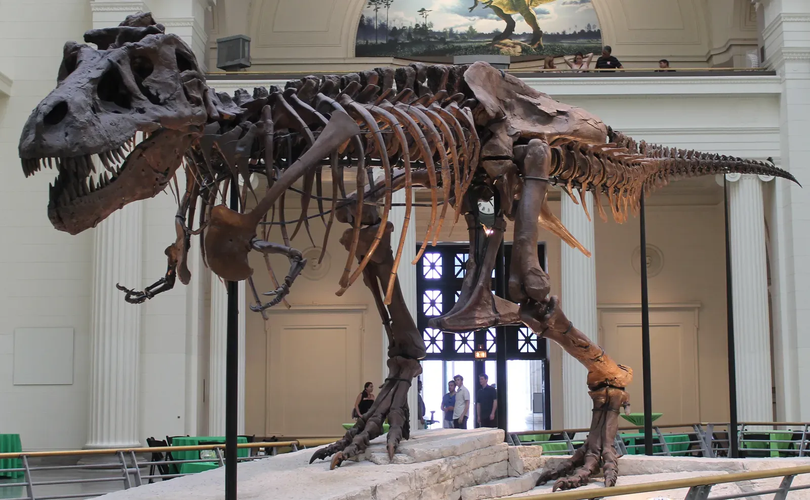
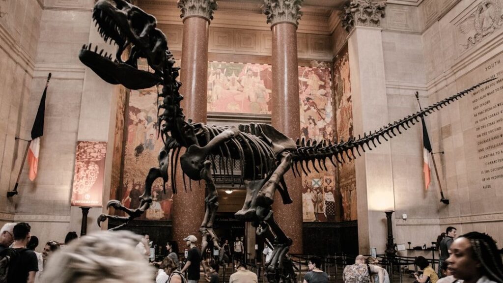
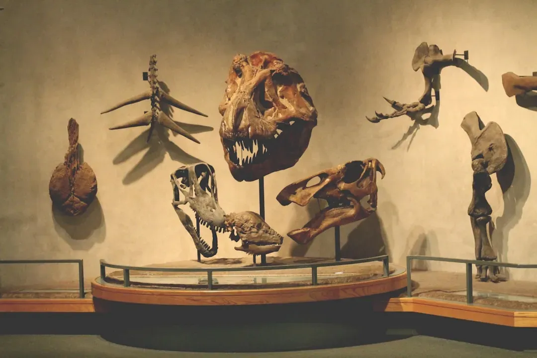
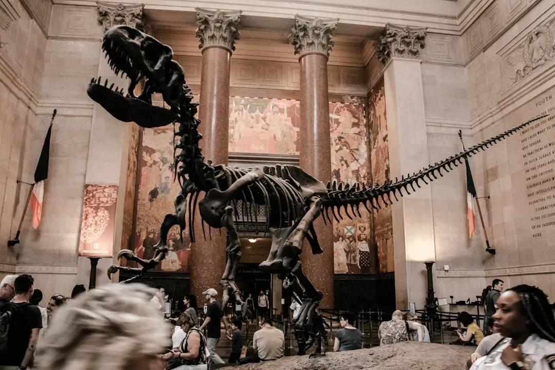
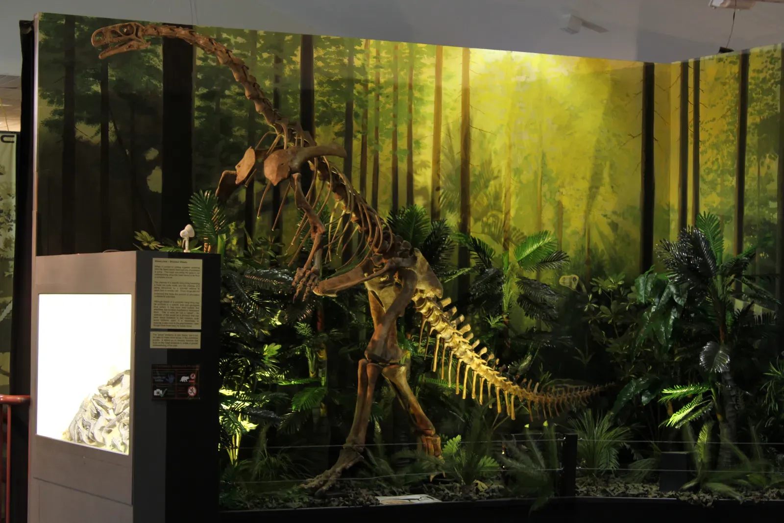
Another quiet simplification is the habit of using a few charismatic species to stand in for entire ecosystems. A massive Tyrannosaurus or Triceratops often represents an entire Late Cretaceous landscape, even though in reality those animals were just a sliver of their ecosystems. Countless plants, insects, small reptiles, and obscure invertebrates lived and died alongside them, but they rarely get more than a small corner display or a label on a mural. The result is an impression that ancient worlds were populated mainly by a handful of superstar animals.
This is understandable from a practical angle: a room full of fossilized worms and tiny fish bones would be scientifically important but not exactly a crowd magnet. So museums lean on representative or “typical” species to tell a larger story. The downside is that visitors may walk away thinking prehistoric life was dominated by giants and predators, when in reality the quiet, small, and numerous organisms did most of the planetary heavy lifting. It is a bit like telling the story of modern Earth using only elephants, lions, and sharks – dramatic, but incomplete.
3. Smoothing Out Debate and Uncertainty into Seemingly Firm Facts
Prehistoric science is full of debate: how dinosaurs behaved, what colors they might have been, how fast they grew, which fossils belong to which species, and even how certain extinction events unfolded. Yet museum labels often present information in a calm, authoritative tone that glosses over the level of scientific argument happening behind the scenes. A sign might say that a dinosaur was a fast-running predator, when in reality that statement is built on best guesses from limb proportions, fossil trackways, and comparisons to living animals.
This simplification is partly about trust. Visitors expect museums to give them solid answers, not a wall of question marks and arguments about bone measurements. So curators tend to highlight widely accepted interpretations and tuck active debates into shorter secondary labels, if at all. The trouble is that this can make prehistoric science look more finished than it really is. In my view, the most exciting displays are the rare ones that openly say something like “scientists are still arguing about this,” because they invite visitors into the uncertainty instead of hiding it.
4. Presenting Evolution as a Neat Ladder Instead of a Bush
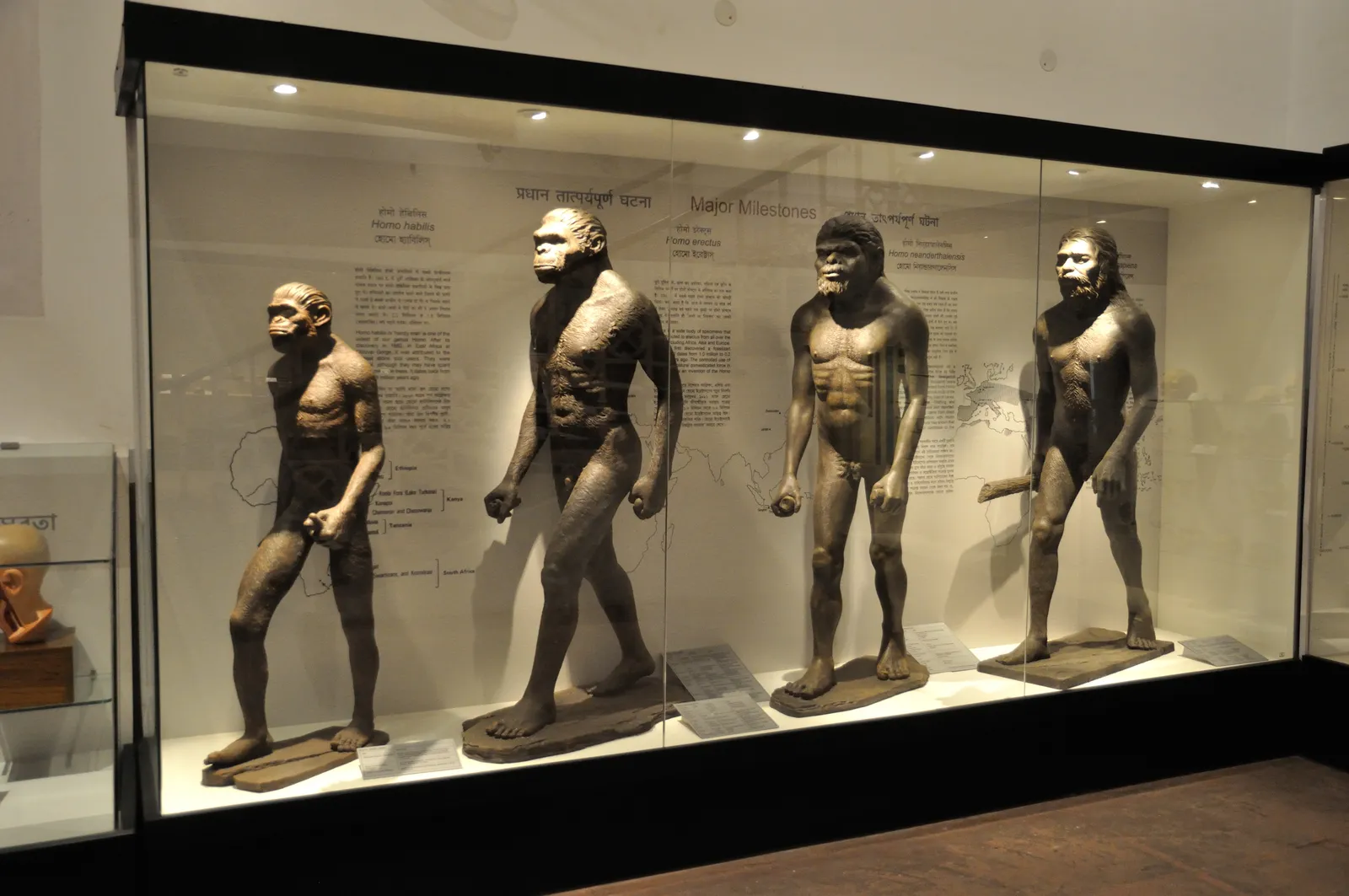
Few things are simplified more aggressively than human evolution. Many museums still lean on that familiar visual of early, stooped figures slowly straightening into a modern human – as if evolution were a single-file line. In reality, our evolutionary history looks much more like a branching bush, with multiple hominin species existing at the same time, interbreeding, competing, and sometimes vanishing without leaving direct descendants. Yet the simple march of progress image sticks, because it is easy to understand and visually memorable.
Some newer exhibits do a better job of showing branching diagrams and emphasizing that we are just one twig on a very large evolutionary tree. Still, the overall narrative often nudges visitors toward the idea of inevitable progress: as if everything in prehistoric history was leading up to us. That is a human-centered story, not an objective one. I think museums sometimes underestimate visitors here; people can handle the idea that we are one experiment among many, not the planned climax of the entire fossil record.
5. Compressing Global Diversity into a Single Imagined Scene
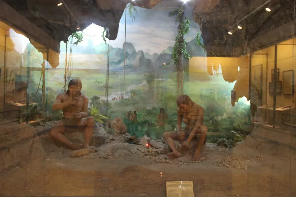
Dioramas are one of the most beloved tools in prehistoric halls, but they are also some of the most quietly misleading. A single, dramatic scene might show several species together that never actually met, or at least were unlikely to share that exact environment in that precise way. Different climates, continents, and time slices get merged into one visually satisfying snapshot. The scene gives visitors an emotional feel for a “typical” prehistoric landscape, even if it is more of a composite than a literal moment in time.
Think of it like a movie based on a true story: grounded in real facts, but rearranged for drama and clarity. A Late Jurassic scene, for example, might gather well-known dinosaur species from different fossil beds across what is now the world, just because they look good together and help illustrate diversity. The trade-off is that people can come away assuming these exact creatures actually coexisted in one place. From a curatorial standpoint, it is a calculated compromise between strict accuracy and storytelling power – and museums rarely spell that out clearly.
6. Downplaying Gaps in the Fossil Record and the Role of Chance
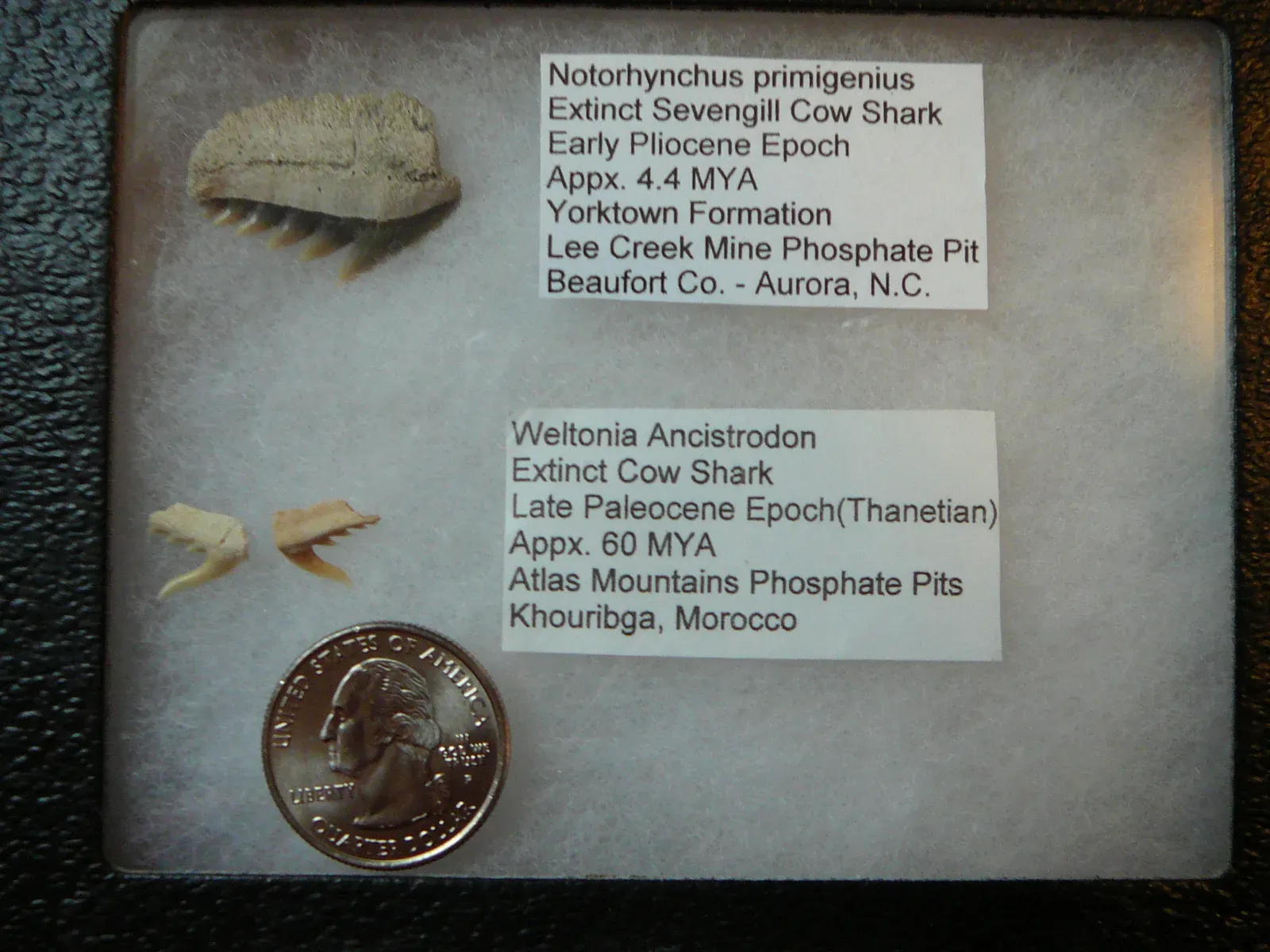
Another way museums simplify prehistoric history is by softening just how incomplete the fossil record really is. Fossilization is rare, survival of fossils is rare, and discovery on top of that is even rarer. Yet display cases often show evolutionary sequences as if we have a near-continuous record from one form to another. The truth is more like a flipbook with many pages torn out, where scientists infer what used to be there based on scattered snapshots and careful comparison.
Labels do sometimes mention “gaps in the fossil record,” but usually only briefly. The idea that whole species, ecosystems, and evolutionary experiments existed and vanished without leaving any trace on public display can be hard to convey in a hallway. So visitors tend to see the fossils that did make it into glass cases as if they were the main cast, instead of a tiny, lucky sample. Personally, I find the role of chance here almost haunting: entire worlds that lived and died are lost to us simply because conditions for fossilization did not line up in their favor.
7. Simplifying Catastrophes and Extinctions into Single-Cause Stories
When it comes to mass extinctions, museums love strong narrative anchors: an asteroid impact here, a volcanic outburst there, a sudden climate catastrophe wiping out the dinosaurs “overnight.” These stories are rooted in serious evidence, but the fuller picture is often more complex, with multiple overlapping stresses, longer timescales, and regional differences. The story a visitor hears tends to favor a single dramatic cause because it is easier to explain and remember in a short exhibit label.
The same goes for smaller extinction events and environmental shifts throughout prehistoric time. Nuanced interactions between changing sea levels, atmospheric chemistry, ecosystems, and evolving species rarely fit neatly on a panel designed for a quick read. So the message can quietly turn into something like “X happened, then the animals died.” This is very streamlined compared to the reality, where Earth’s history is more of a tangled drama of feedback loops and cascading effects. In my opinion, oversimplifying these stories can also dull an important lesson: our planet’s systems are not simple switches but highly interconnected networks that can react in surprising ways.
8. Designing Exhibits Around What Visitors Already Expect to See
Finally, museums simplify prehistoric history by quietly leaning into what visitors already think they know. If people show up mainly excited about huge dinosaurs, saber-toothed cats, and early humans, exhibits are going to prioritize those familiar elements. This does not mean curators are dishonest; it means they are working within attention limits. A family with kids will likely spend more time under a giant skeleton than reading carefully about ancient plankton, even though those plankton helped shape the planet’s climate in ways we still depend on.
To keep visitors engaged, museums often package complex concepts – like radiometric dating, plate tectonics, or climate feedbacks – into short, approachable segments or interactive displays that reduce the detail down to catchy takeaways. The trade-off is that the deepest, messiest parts of the science remain in the background. I get why this happens; nobody wants to turn a museum visit into a dense graduate seminar. Still, there is a part of me that wishes more galleries trusted visitors to wrestle with the weirdness and uncertainty of deep time, even if it meant fewer photo ops in front of toothy skulls.
Conclusion: The Comfort – and Cost – of a Neat Prehistoric Story
When you add up all these quiet simplifications – straight timelines, representative species, smoothed-over debates, neat evolutionary ladders, and cinematic dioramas – you end up with something powerful but slightly misleading: a prehistoric story that feels much more orderly than the reality ever was. Museums are not trying to deceive anyone; they are doing what they have to do to turn vast, messy evidence into something people can absorb in a single visit. Still, I think we should be honest that the version of prehistory we meet behind the glass is more like a beautifully edited documentary than raw, uncut footage.
My own opinion is that the next evolution of museum design should lean harder into the uncertainty, the gaps, and the weird side branches that never made it into the main narrative. Visitors can handle messiness; in fact, I suspect many of us would find it more thrilling to see how much we do not know than to pretend the story is already finished. Maybe the real magic is not in pretending prehistory was simple, but in admitting that it was wild, tangled, and still partly hidden. Next time you stand under a towering dinosaur skeleton, will you see it as the whole story – or as one surviving page from a book that is still mostly missing?